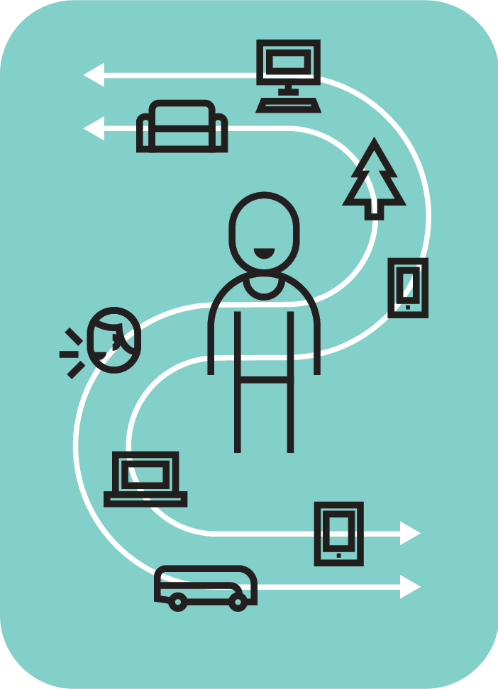
Character system
I saw a need for a character redesign. The characters were used to show humans in different contexts and with different ways of being. I looked to Microsoft iconography and the Noun Project for inspiration. I settled on a thick line style that could handle a wide variety of variation, while still making an strong visual impression.
Like any lived in brand, we started to get feedback. For a process claiming to be inclusive, people pointed out our figures lacked representation. I immediately got to work on a 2nd batch mixing different heads with different bodies to multiply the variety and give other designers options using them. After I left, I was happy to see the character designs pushed even further.
Work
Premera Blue Cross
Microsoft inclusive design
Eight Bit Studios
Art direction and UX design work
Designkitchen


