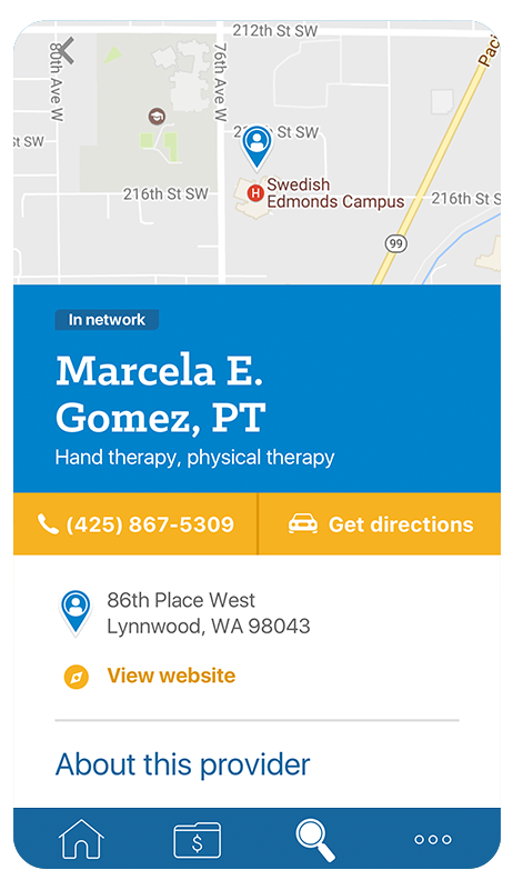
Mobile app visual language
First iteration
I conducted a white-boarding session taking the company values, brand attributes, and had the group define a list of desirable and undesirable qualities. After a comparative analysis of mobile applications, we had another session and mapped the qualities onto the images from the analysis. This drove the visual direction.
#
Visual design + comparative analysis + workshops
After new company brand applied
2 months before our app launch, the company released a new brand. We had to adapt our designs to fit. There were many presentations and feedback rounds with the brand team. We were on of their first consumers and really tested the limits.
#
Visual refresh
Work
Premera Blue Cross
Microsoft inclusive design
Eight Bit Studios
Art direction and UX design work


